Content Box & Widget Style Default A solid box shadow on the bottom of the box. Background and border colors can be adjusted in Colors ▸ Content Box & Widget Minimal No shadow. Background and border colors can be adjusted in Colors ▸ Content Box & Widget Shadow A heavy and […]
Typography ▸ Buttons
The button font settings control the display of buttons throughout the website. Control the styles in Content ▸ Global and colors in Colors ▸ Global
Typography ▸ Homepage Widget Descriptions
The homepage widget description font settings control the widget descriptions on the homepage widget area.
Typography ▸ Homepage Widget Headings
The homepage widget heading font settings control the main widget titles on the homepage widget area.
Typography ▸ Content Box Headings
The content box heading font options adjust the standard content box and widget headings found in listings and blog widgets.
Colors ▸ Footer
“As Seen On” Background Color The background color for the “As Seen On” section above the footer. Manage the As Seen On logos in Footer ▸ As Seen On Footer Widgets Text Color The text color for the footer widgets. Manage the Footer Widgets in Widgets ▸ Footer Footer Widgets […]
Colors ▸ Content Box & Widgets
Content Box Background Color The background color of content boxes. Adjust the style in Content ▸ Global Content Box Border Color The border color of content boxes. Adjust the style in Content ▸ Global Content Box Accent Color A secondary color to use for content accent elements, such as borders.
Colors ▸ Inputs
Input Box Text Color The text color for input boxes. Input Box Background Color The background color for input boxes. Input Box Border Color The border color for input boxes.
Listings ▸ Map Marker Icons
Add Icons To set a unique icon for a specific category, follow the steps below: 1 Search for the category (or categories) in the search box. 2 Choose the icon you want to assign to the marker. 3 Click Add Icon Once set the category and its associated icon will […]
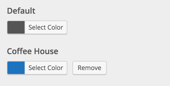
Listings ▸ Map Marker Colors
Add Colors To set a unique color for a specific category follow the steps below: 1 Search for the category (or categories) in the search box. 2 Choose the color you want to assign to the marker. 3 Click Add Color Once set the category and its associated color will […]