Primary Color
The color for primary links and buttons text color
Sample from the demo:

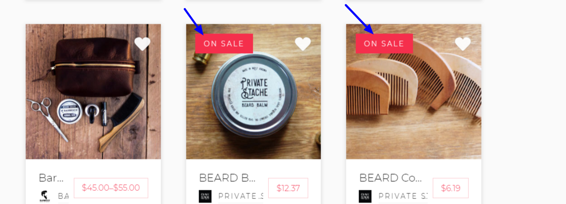
Secondary Color
The background color to secondary badges and buttons
Sample from the demo:
Light
Specifies a background color or text color to sections or elements with a light background
Dark
Specifies a background color or text color to sections or elements with a dark background
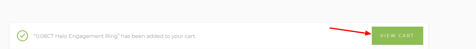
Success
The default color outline and background to buttons and badges after a successful action or else buttons and elements with the success class
Sample classes:
.btn-success
.btn-outline-success
.badge-success
.badge-outline-success
Sample Output from the demo after a product addition to cart:
Information
The color outline and background to buttons,elements and badges with the info class.
Sample Classes:
.btn-info
.btn-outline-info
.badge-info
.badge-outline-info
Warning
The color outline and background to buttons,elements and badges with the warning class.
Sample Classes:
.btn-warning
.btn-outline-warning
.badge-warning
.badge-outline-warning
Danger
The color outline and background to buttons,elements and badges with the warning class.
Sample Classes:
.btn-danger
.btn-outline-danger
.badge-danger
.badge-outline-danger