With Modalify, you can create seamless popups in your listing website to build your email list. As the plugin name suggests, it has the modal form of opening popups which is something good.
Below are some of the steps you need to follow when creating a popup with the plugin.
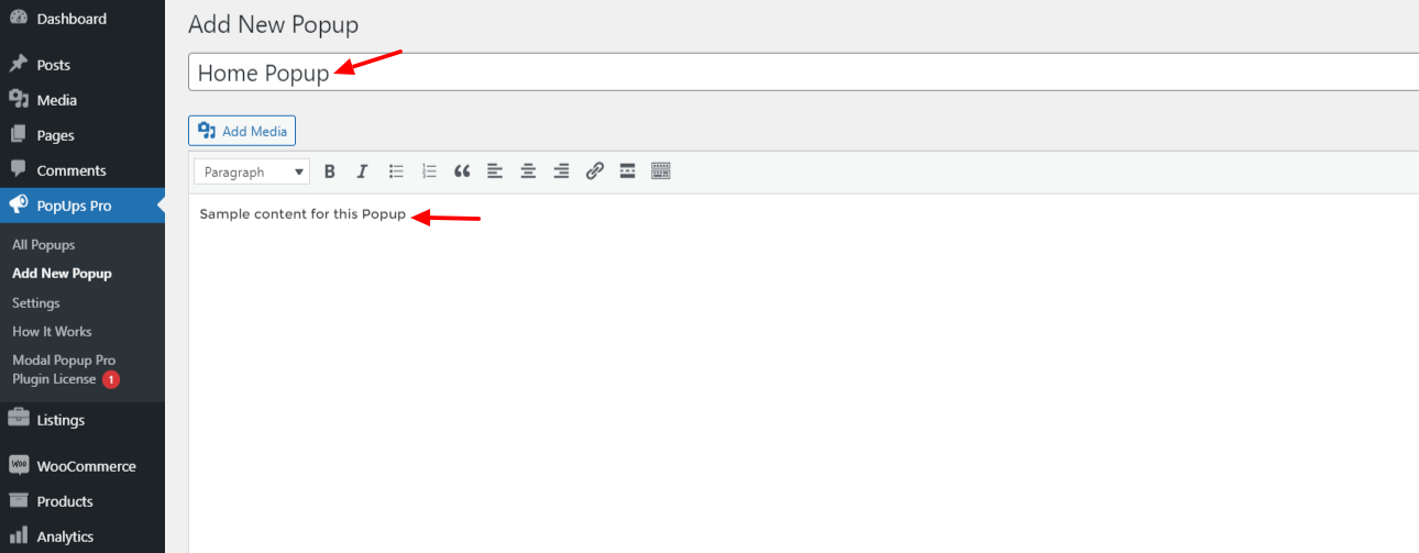
Step-1. Go to “PopUps Pro >> Add New Popup”.
The first step involves following the normal plugin post-type step which is to add your first popup item. On the left sidebar, you should be able to see the PopsUps Pro item after installation. Hover on it and then click on add new popup.
On the next window it opens, insert your popup title and add some content to it as well. Here is a screenshot of this:
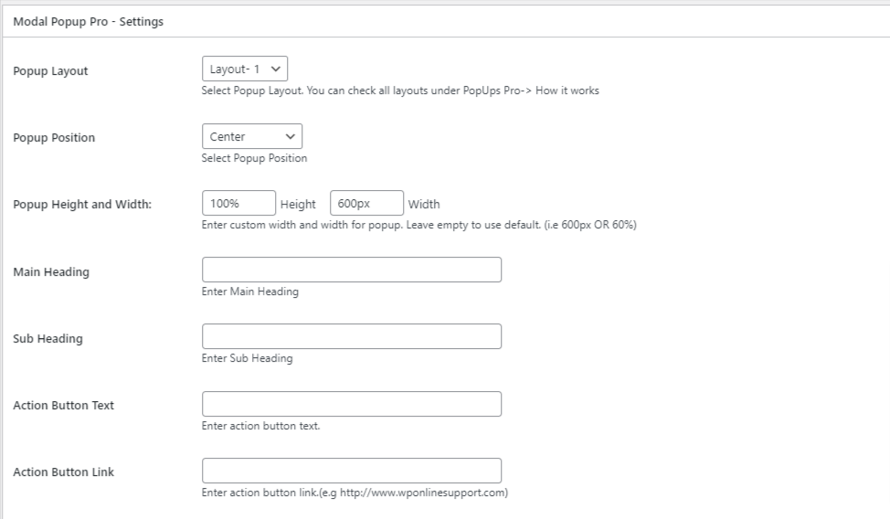
Step-2. Modalify Popup Settings
In this section you can add the popup layout you intend to use in your site. There are a total of 10 layouts you can choose from.
Next, select the popup position on your site. There are several positions to choose from which include: center, Full Screen, Left Top, Left Center, Left Bottom, Right Top, Right Center, Right Bottom.
The next step involves adding the Popup Height and Width. This enables you to set the size of your popup using reasonable width and height sizes in percentage or pixels.
Last;y there are fields to include the Main Heading, Subheading, Action Button Text, and the Action Button Link for your popup.
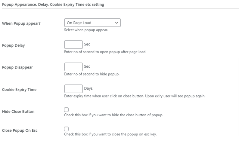
Step-3. Popup Display and Cookie Settings
This section will allow you to set when the popup appears on your site. This section acts as a trigger section where users can choose what triggers the popup to display.
On this, you can choose four trigger settings which include:
- On page load
- After X seconds of inactivity
- When Page Scroll
- On exit intent
Then you can set the Popup Delay which is the no of seconds required to open the popup after page load. Similarly, you need to enter the popup Disappear which is the no of seconds to hide the popup.
When it comes to cookies, you can set the Cookie Expiry Time In terms of Days.
You need to enter the expiry time when the user clicks on the close button. Upon expiry, the user will see the popup again.
If you want to hide the close button from the popup so users are not able to close the popup until the desired result is met, then you can have this option enabled.
Alternatively, you can use the next option which is to Close Popup On Esc. This option is selected if you want to close the popup on the ESC key.
Step-4 Popup Design
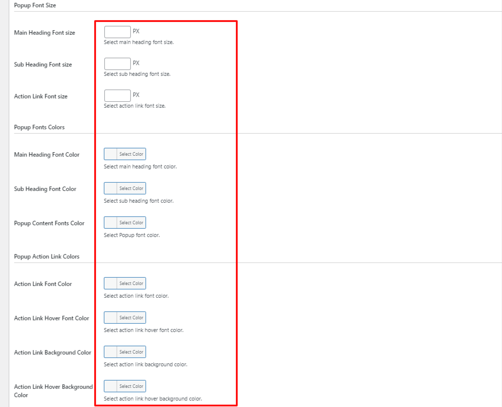
Font Customization Design
This section allows you to set different font sizes and colors for the various sections mentioned above.
In the first section, you can set a font size of your choice on the Main Heading Font size, Sub Heading Font size, and the Action Link Font size.
Next, you can choose the font color for the same sections as well, that is Main Heading Font Color, Sub Heading Font Color, and the Popup Content Fonts Color.
Similarly, do the same for the Action link. Set the Action Link Font Color, the action Link Hover Font Color, the Action Link Background Color, and the Action Link Hover Background Color.
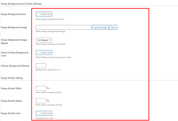
Step-5 Popup BackGround Design & Overlay Settings
This section designs the overall modal popup and not the individual fields. You can change the background color or set a background image then add an overlay color and also set its opacity for your whole popup item.
In the next section, you can set different border sizes and colors as well. When designing the border you can add the Popup Border Width, Popup Border Radius in terms of pixels, and lastly the Popup Border Color.
Should you have some custom CSS or JS to design your popup there are sections where you can insert this to customize your popup with your own code.

Once you have this all done you can publish your popup.